Enterprise web app redesign
(scroll all the way down to see designs)
Project Background
In the mid 2010’s, hip coworking brands set a new standard for shared office amenities. Not to be left out, traditional commercial offices also started investing in shared amenities. These new amenities were on par in design with their hip coworking counterparts, however the underpinning technology oftentimes was not.
Compound’s founders recognized this opportunity and began creating tools to fill those gaps. The first was AmenityOS— a saas tool providing enterprise booking and payment tools for Class A office buildings and their tenants.
“Amenity utilization is up 400%. Tenants are responding to the convenience, ease of use, and time saving features that AmenityOS provides.”
— Mark Witschorik, Asset Manager at CXP (NYSE)

Project Summary
Goal
A year into operation our version one UI began to bloat from new feature additions. Additionally, our ops team was in desperate need of tools to manage the increase in inbound requests. Our goals was to reduce time to booking and automate tasks for our ops team.
Research Tools
To identify the areas of greatest impact, I used the following methods:
User interviews with our power users and internal ops team
Hotjar heatmaps and screen recordings
UX audits of our existing workflow
Priorities
After a week of planning and data gathering, I discovered significant roadblocks for booking and internal operations. The following priorities were defined:
Reduce time to checkout by streamlining the booking workflow.
Reduce last-minute reservation change requests (primarily last minute seating arrangement changes which could take up to 2 hours to complete).
Reduce user on-boarding time — user profile management was being done one user at a time or in bulk with help of engineers. Ops needed a way to manage users autonomously.
Improve the overall look and feel of the app.
Solutions
After synthesizing qualitative and quantitative data from research the following solutions were executed:
Reduce time to booking
Make the Room Search the first step in the user journey and include a hotlink to past reservations at the top of the page. Surfacing these options on the landing screen would save users time.
Merge the Room Configuration page with the Booking Calendar page’s right hand control panel further reducing the number of clicks to complete a booking.
Reduce layout change requests and last minute cancellations
Increase visibility of the information icon on the room cards. Heatmap data revealed that less than 20% of users clicked on this UI element which lead to more information about available layouts.
Add a photo carousel to room card image section so users could see pictures of all available layouts on Step 1 —Room Search.
Add a layout filtering to room search allowing users to find the rooms with the layouts they needed before continuing their booking.
Reduce user on-boarding time
Redesign the user management table to create separate but related tables for tenant companies and their users. These tables would also include bulk importing and editing features.
Improve overall look and feel
In addition to functional changes, I created a new style guide and a set of reusable components in concert with our transition to React JS. The changes included notifications, error handling, and form validation styles, a new paragraph font for greater readability, and more white space.
Outcome
I created an interactive prototype to test users’ ability to complete a booking task. Compared with with completion times from initial interviews, the new UI reduced time to booking by 30%. User feedback was also very positive. The internal tool I designed, received buy in and sign-off from our ops team. Unfortunately, the development of the new design was disrupted by COVID.
Room Booking Workflow Before
(Click images to zoom in)
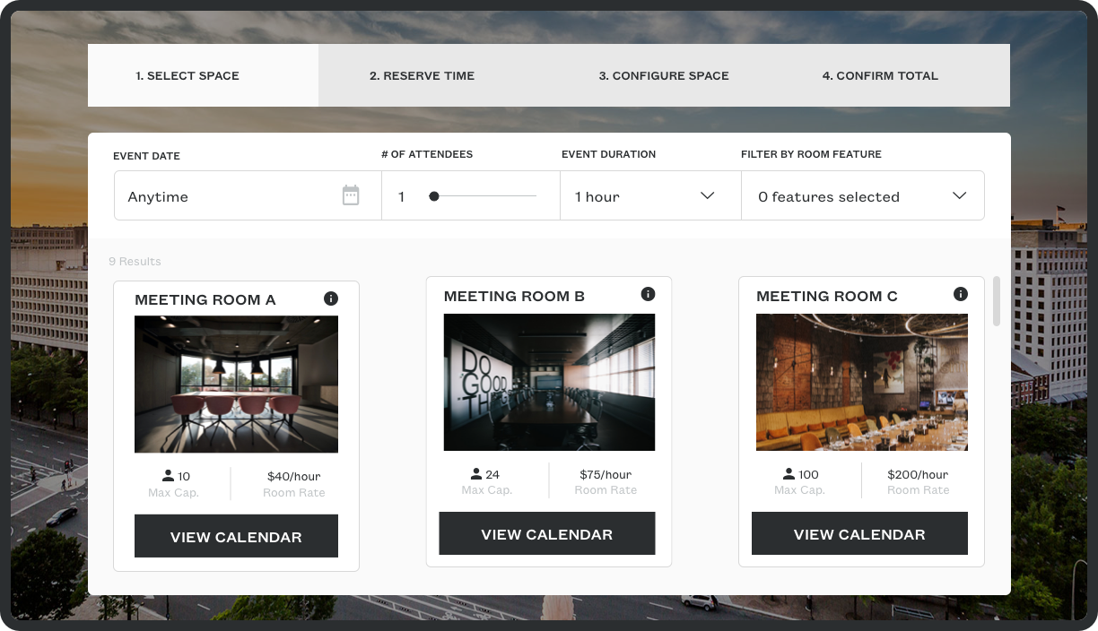
V1 Room Search
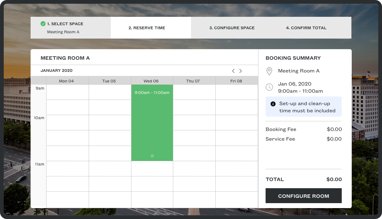
V1 Booking Calendar
Booking Workflow After
(Click images to zoom in)

